
RESIDENCY DIARY Part 5: The process of bringing prints to life!

Returning to the gorgeous, sun-filled Guanlan Printmaking Studio in this post, I wanted to talk you through my creative process during the six-week artist residency I undertook earlier this spring. After a few initial days of journalling, sketching, and allowing creativity to come through me (can you tell I’ve been paying attention to The Artist’s Way?), I settled on themes of night-time, solitude, and journeys into the unknown.

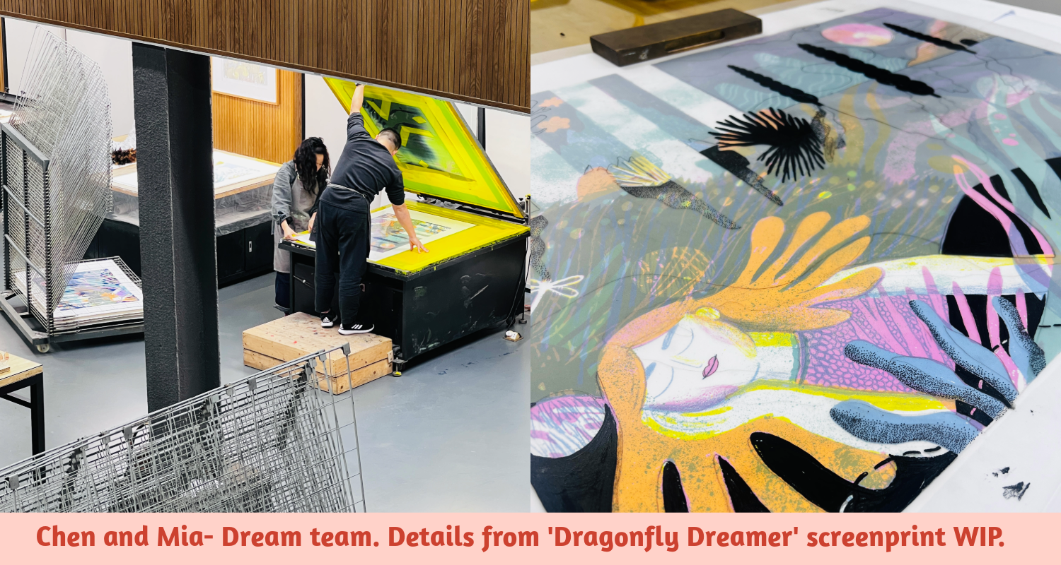
The first print, which became known as The Dragonfly Dreamer, emerged from deep in my subconscious pretty early on. From that point, I had a fairly clear vision for the composition: a peaceful figure in the depths of the woods, with a full moon illuminating a path toward the unknown waiting behind her. I initially sketched it on paper but soon returned to Procreate on my iPad to work out colour combinations—particularly where overlapping colours were essential to the image.

Once the colour plan was sorted, I began drawing out the screenprinting transparencies by hand using every tool under the sun. If you’re unfamiliar with the screenprint design process: each colour must be drawn out separately (these are sometimes called colour separations, transparencies, negatives, positives—confusing, I know—or simply stencils). These are what you use to make your screens: mesh stencils that allow paint to pass through, building up the image layer by layer.
I loved the hands-on process of creating these. You have to use opaque materials—Chinese ink, lithograph pencils, black acrylic pens—so the UV light doesn’t pass through when burning the image onto the screen. There’s something super satisfying about building up these solid black drawings and getting creative with textures and halftones. In recent years I’ve relied more on digital tools like Procreate (especially for erasing negative space), but early in this residency, I knew I wanted to go back to analogue—to get my hands dirty again.
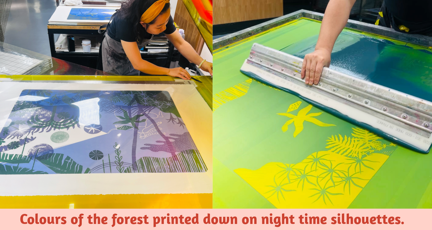
There was black paper collage, lithograph texture, ink drawings, masking fluid, and oh-so-many painstaking dots drawn with fineliners. Time-consuming, but joyful. Each transparency was exposed onto a screen; colours were mixed (and tested many times); and then each layer was squeegeed onto the paper by the brilliant technician team. Due to the humidity of the South China tropics, we could only print on dry days and needed extra drying time between layers. I also learned there’s a limit to how much transparent medium you can add—my prints back in Wales used a lot of transparency, but here, with 5–7 colour layers, it got tricky: the more transparency, the stickier it gets, and the longer it takes to dry.
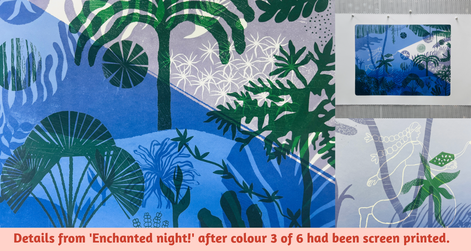
This project pulled me away from my usual vibrant, warm primaries. The night-time theme led me to deeper, moodier colours—blues, purples, and flashes of pink and orange under moonlight. The transformation between layers felt even more dramatic than usual—equal parts electrifying and terrifying. Screenprinting with transparency is unpredictable: a green layer early on affects how the final colours appear. For the first time, I didn’t decide upfront how many layers each print would have. Unlike previous Dragonfly Diaries prints (usually five layers), I approached this series more intuitively—learning to respond in the moment rather than mapping it all out.
One of the coolest experimental techniques we developed involved creating grainy, speckled textures—similar to what I often try to replicate with Procreate brushes. We cut stencilled areas into thick acetate, placed them beneath the screen, sprinkled baby powder into the cut-outs, removed the acetate, and printed over the top. This gave a beautiful, grainy finish—particularly effective on the moon in The Dragonfly Dreamer. Each of the 30 prints in the edition has a unique moon: a full month of moons!
I’m incredibly grateful to Mia and Chen, the screenprint technicians, for their dedication and humour. Their patience made the whole process enjoyable and collaborative. I learned so much from them—not just about colour mixing and screen exposure, but also Mandarin names for printmaking tools, Chinese tea traditions, and even a few trending memes on Chinese TikTok. They’re both brilliant printmakers in their own right, and I’ll be sharing some of their work in my next blog post.
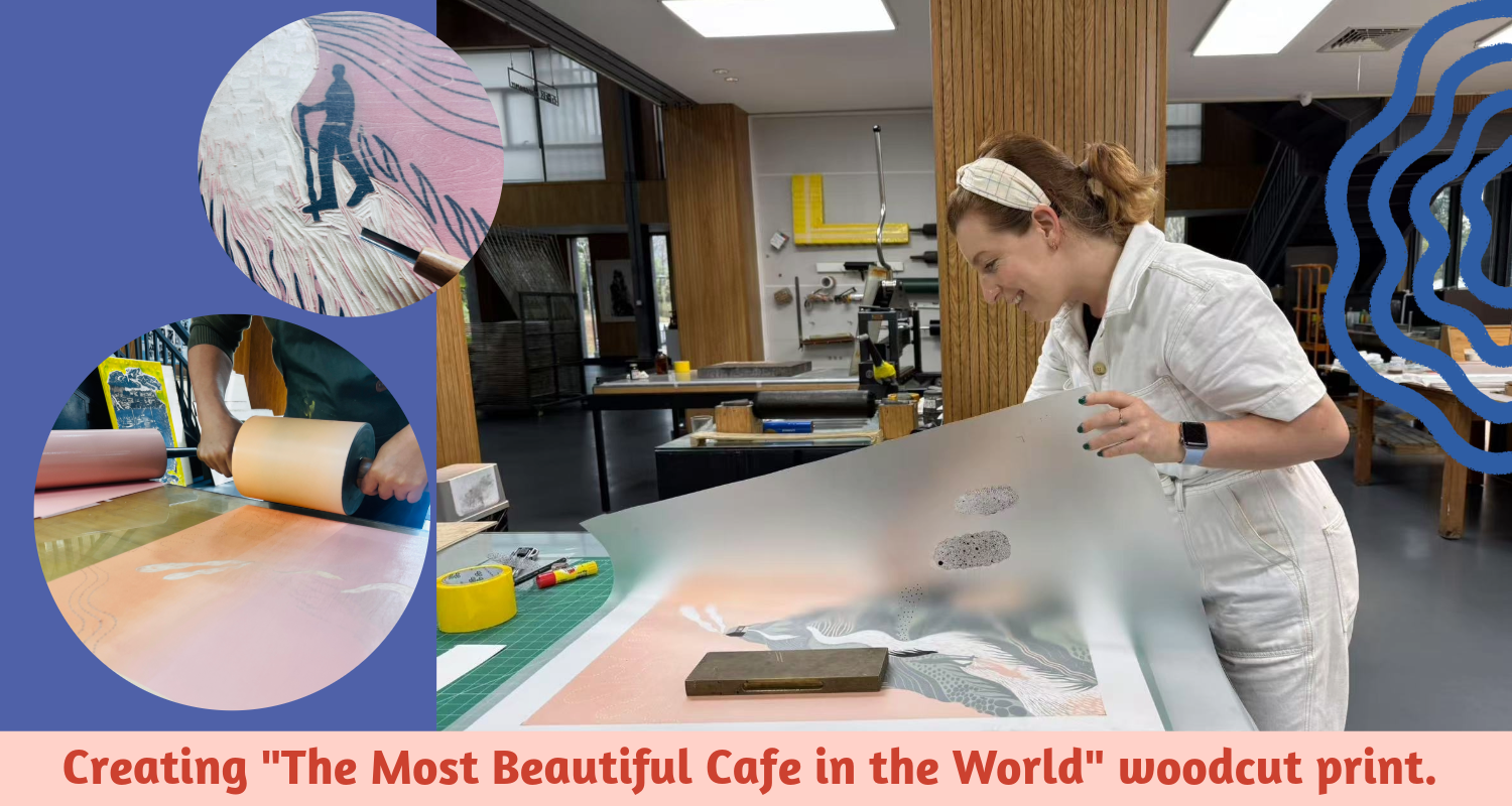
Then it was time for the woodcut print. I was so excited to try a reduction woodcut, especially after seeing fellow resident Oleg’s epic piece of Guernsey Harbour. When I was handed a beautiful piece of wood, I returned to my sketchbook and chose a drawing from a hike in the Caucasus last summer: Liam, facing a steep rock face under the scorching sun—where, unexpectedly, we discovered The Most Beautiful Café in the World. A humble hut with water, Coca-Cola, and snacks, it was an oasis after a relentless climb. That moment felt worthy of preserving in wood and ink.
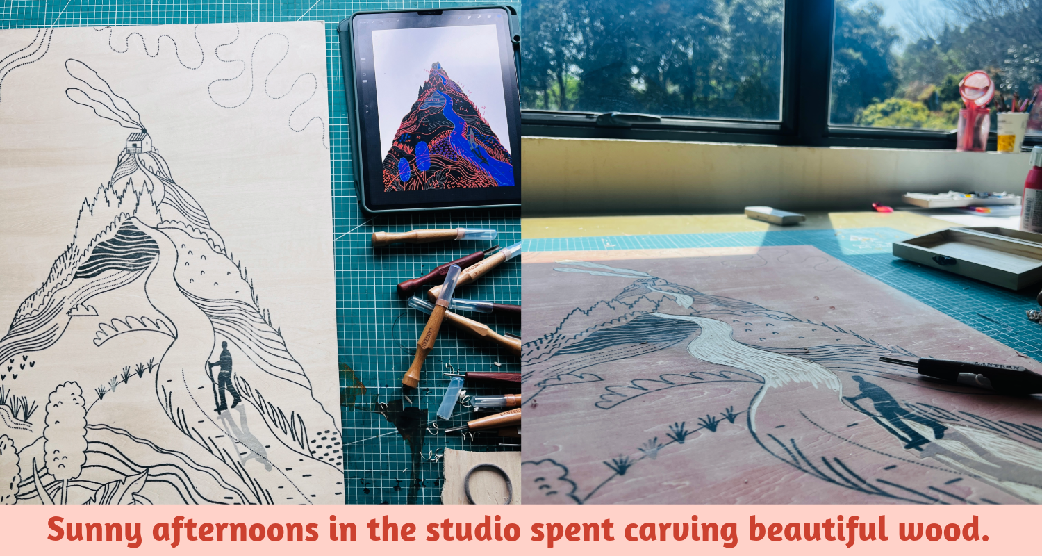
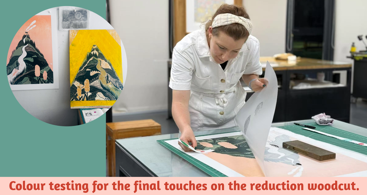
As a complete beginner in this technique, I was nervous—but the process was a joy. The materials were excellent, and I was surprised by how naturally it flowed. The thrill of reduction woodcutting—where each layer destroys the previous one—kept me fully immersed. I also broke from my usual style: shifting from landscape format and primary colours to a dreamy pink-orange ombré sky and lush green hills. More than anything, I loved the feeling of beginner’s joy, stepping into the unknown. I hope there’s much more of that to come.
In my final blog instalment about my residency I’ll be sharing some of my favourite artwork, techniques and printmaking insights that I discovered from my time in the studio, and I’ll be sharing some glimpses of the 3 finished prints too. Thanks for reading! Rhi x